

Let’s understand one of the most fundamental web design principles the CSS box model. The CSS box model enables us to make changes to your web page layouts and the elements to improve your website look and feel.
Not clear much. Ok let's dive into CSS Box Model
What is CSS Box Model?
The CSS box model is a container or a box that wraps around every HTML element. The box model determines how your web page is rendered on the internet. In this model, a rectangular box is generated for HTML elements. Each is placed according to its dimension, type, positioning, relationship to other elements, and viewport size.
The box model consists of content , padding , border & margin
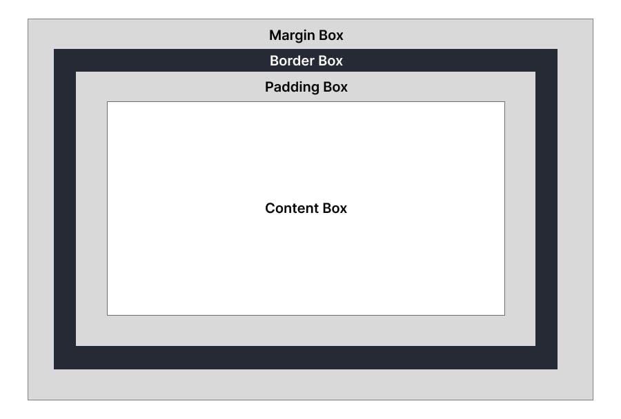
Content
The innermost rectangle is known as the content area. It may consist of content like images, text, or other forms of media content.
The content area is only as wide and tall as it needs to be to hold the content, if the element is a block element, then the content edge can also be set with the min-width , max-width ,min-height ,max-height properties.
Height and width attributes are specified in a standard CSS box model. If the padding, border, and margin properties are also specified, then they must be added to the width and height to calculate the total size of the element.
Example
If the content width is 500px and add 30px padding, 10px border, and 10px margin. Then the total width of the box is 600px, here it is adding content-width, padding-left and padding-right, border-left and border-right, and margin-left and margin-right (400 + 30 + 30 + 10 + 10 + 10 + 10).
Padding
Padding is the space between the border and the content of an element. Padding is important in web design because it helps make content more visible and readable.
Padding can be defined with the following properties: padding-top, padding-bottom, padding-left, and padding-right.
Note: Above element that got some padding appears larger than the element that got zero padding. The blue background helps to illustrate where the element's borders are.
You can also set padding on each side individually, by using padding-top, padding-right, padding-bottom, or padding-left.
Border
The border property lets us add and style a line around the content padding area. By default, an element will not have a border, but you can define one with the border property. The border-width, border-color, and border-style properties can define border width, color, and style. Border-style values include solid, dotted, dashed, double, groove, ridge, and none.
The dimensions of the border area are the border-box width and border-box height. When specified, the width and height attributes determine the perimeter of the border area. If the box-sizing property is set to border-box, you can define the border size with min-width, max-width, min-height, and max-height.
Margin
The margin is the empty space separating the element from its neighbors and the outermost layer of the CSS box model. Its size can be defined by the following properties: the margin-left, margin-right, margin-top, and margin-bottom properties.
If four values are defined, they represent the top, right, bottom, and left, respectively.
Margin is the space outside the border area, whereas padding is inside the border area.
Note: Above it should be clear to see that the more margin on the left side of the element.
Border Radius
border-radius can round off the borders of your element. It can be customized by setting a border-radius.
Note: Border-radius default value is 0, which means that the border will not be rounded. You can also use 50% to round off the border fully.
Box Shadow
Using box-shadow property you can add a shadow around the element. You can use inset and outset to make the shadow appear inside or outside of the element
It takes five values, the horizontal offset, the vertical offset, the blur radius, the size of the shadow, and finally, the color. The color is optional, and if you don't specify it, the shadow will be black.
Syntax
Box-shadow: Horizontal offset Vertical offset Blur radius Shadow size Color optionl
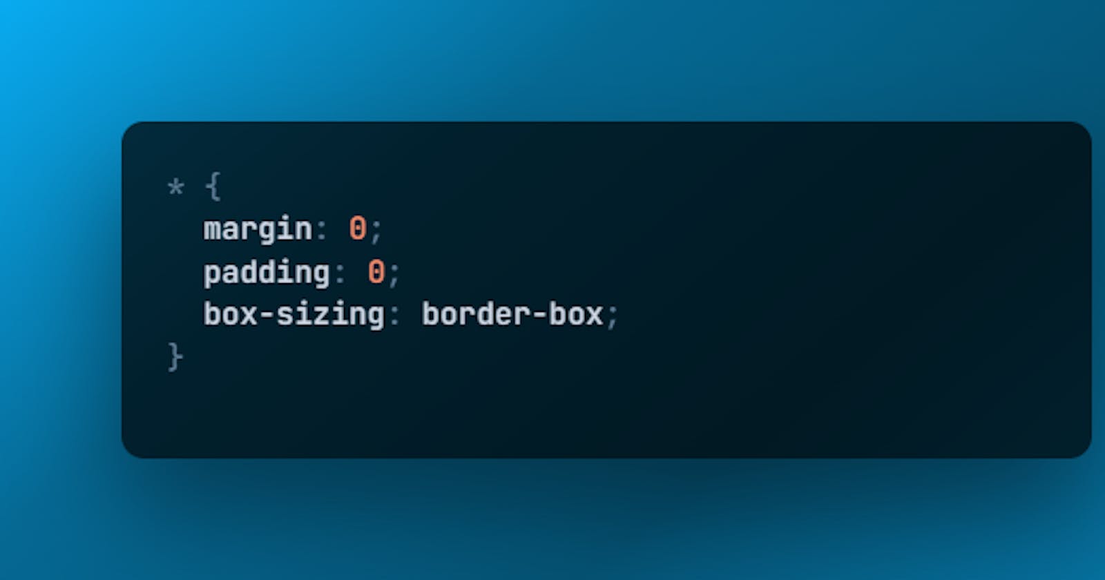
Box Sizing
The box-sizing allows you to control how an element‘s width and height are calculated. It only has two values
Content-box
Border-box
Content-box
It is a default value that makes it so that the content itself only determines the width and height. Any padding or border is extra and makes the element bigger.
Border-box
It does the opposite effect means all additional padding and border are now included in the width and height. This means that if you require an element to a specific size, any added padding and border will make the remaining content space smaller to maintain that overall total size. This is useful for things like making a div that is always the same size but has different content inside.
**Note: The aqua square applies the padding and border on top of its normal width and height, it appears way bigger than the blue square and keeps itself at 5rem its width and height no matter what. This is because the blue square is using border-box and the pink square is using content-box.
Thank you for reading 👨💻. If you found this article useful. Share your feedback that would help me in the future.