

 Designing a responsive website you would want your elements to be dynamic in their behavior such as width, height, resolution, etc according to the different screens and devices using the website. Here using flexbox your website elements get adjusted according to the different device screen sizes.
PermalinkWhat is Flexbox?
Flexbox layout makes elements change their behavior according to the type of device displayed on them. Flexbox layout is one-dimensional and allows the placement of elements inside a container.
Flexbox History
Flexbox was introduced in CSS3 to arrange items more efficiently and dynamically before we have four layout methods.
- Block It creates sections on a web page.
- Inline It is a layout method that is used for text.
- Table It is used for a table with two-dimensional data.
- Positioned It is used for a definite (fixed) position of an element.
PermalinkFlexbox Components
It consists of two components.
- Flex-container To set container element's to the
displayproperty to flex i.edisplay: flexwill enable flexbox properties to this container. Flexbox properties specify how browsers should layout items within the flexible box model.
Note: Here flex tells the browser to display the selected HTML element as a block-level flexible box model.
- Flex-items: Flex items are the direct child of a flex container.
.container {
  display: flex;
}
PermalinkFlexbox axis
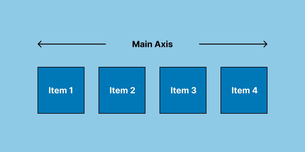
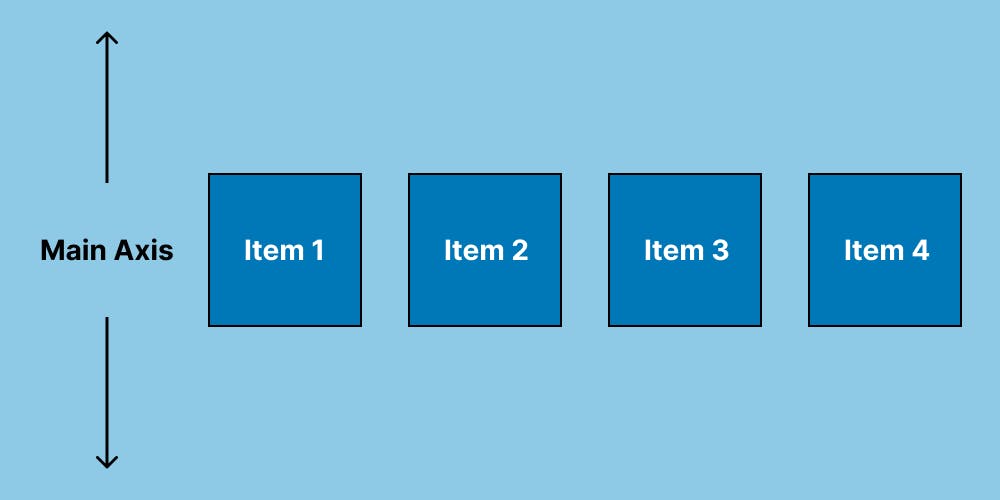
- Main axis
It is defined by flex-direction (from left to right). Axis has four values row, row-reverse, column, and column-reverse.
If you choose a row or row-reverse value, the flex container and items will be aligned horizontally. Whereas if you choose column or column-reverse values, the flex container and items will be aligned vertically.
- Cross Axis
The direction of the axis is perpendicular to the main axis.
If your flex-direction (main axis) is to row or row-reverse then the cross axis will move along to columns downward. Whereas if your flex-direction (main axis) is to column or column-reverse then the cross axis will move along to rows.
Note: Both of the axes have a starting, an ending point, and a certain length between these points.
Let's go & see some flexbox properties
PermalinkFlexbox properties
PermalinkFlex-direction
Flex items as primarily laid out either in horizontal rows or vertical columns.
Syntax
.container {
  flex-direction: row | row-reverse | column | column-reverse;
}
row(default) Left to Right in LTR || Right to Left in RTLrow-reverseRight to Left in LTR || Left to Right in RTLcolumnTop to Bottomcolumn-reverseBottom to Top
PermalinkFlex-wrap
In flex-wrap, if there is not enough space in the container the items will move on multiple lines. The initial value of the flex-wrap property is nowrap.
Syntax
.container {
  flex-wrap: nowrap | wrap | wrap-reverse;
}
nowrap(default) All flex items will be on one line.wrapFlex items will wrap onto multiple lines, from top to bottom.wrap-reverseFlex items will wrap onto multiple lines from bottom to top.
PermalinkFlex-flow
We can set flex-direction and flex-wrap properties using flex-flow.
Syntax
.container {
  flex-flow: column wrap;
}
PermalinkJustify-content
It is used to align the items on the main axis, the direction in which flex-direction has set the flow.
Syntax
.container {
  justify-content: flex-start | flex-end | center | space-between | space-around | space-evenly | start | end | left ;
}
flex-start(default) Items are packed toward the start of the flex-direction.flex-endItems are packed toward the end of the flex-direction.startItems are packed toward the start of the writing-mode direction.endItems are packed toward the end of the writing-mode direction.leftItems are packed toward the left edge of the container.rightItems are packed toward the right edge of the container.centerItems are centered along the line.space-betweenItems are evenly distributed in the line.space-aroundItems are evenly distributed in the line with equal space around them.space-evenlyItems are distributed so that the spacing between any two items is equal.
PermalinkAlign-items
It specifies how browsers should position a flexible container's items along the cross-axis of the flexbox.
Syntax
.container {
  align-items: stretch | flex-start | flex-end | center | baseline;
}
stretch(default) Stretch to fill the container (still respect min-width/max-width).flex-startItems are placed at the start of the cross-axis.flex-endItems are placed at the end of the cross-axis.centerItems are centered on the cross-axis.baselineItems are aligned such as their baselines align.
PermalinkAlign-content
It alters the behavior of the flex-wrap property and is pretty much similar to the align-items property with the only difference being that it aligns the flex lines rather than the flex elements.
Note: This property only takes effect on multi-line flexible containers, where flex-wrap is set to either wrap or wrap-reverse).
Syntax
.container {
  align-content: stretch | flex-start | flex-end | center | stretch | space-around | space-between;
}
PermalinkGap, row-gap, column-gap
It applies that spacing only between items not on the outer edges.
Syntax
.container {
  display: flex;
  gap: 10px;
  gap: 10px 20px;  /* row-gap column gap */
  row-gap: 10px;
  column-gap: 20px;
}
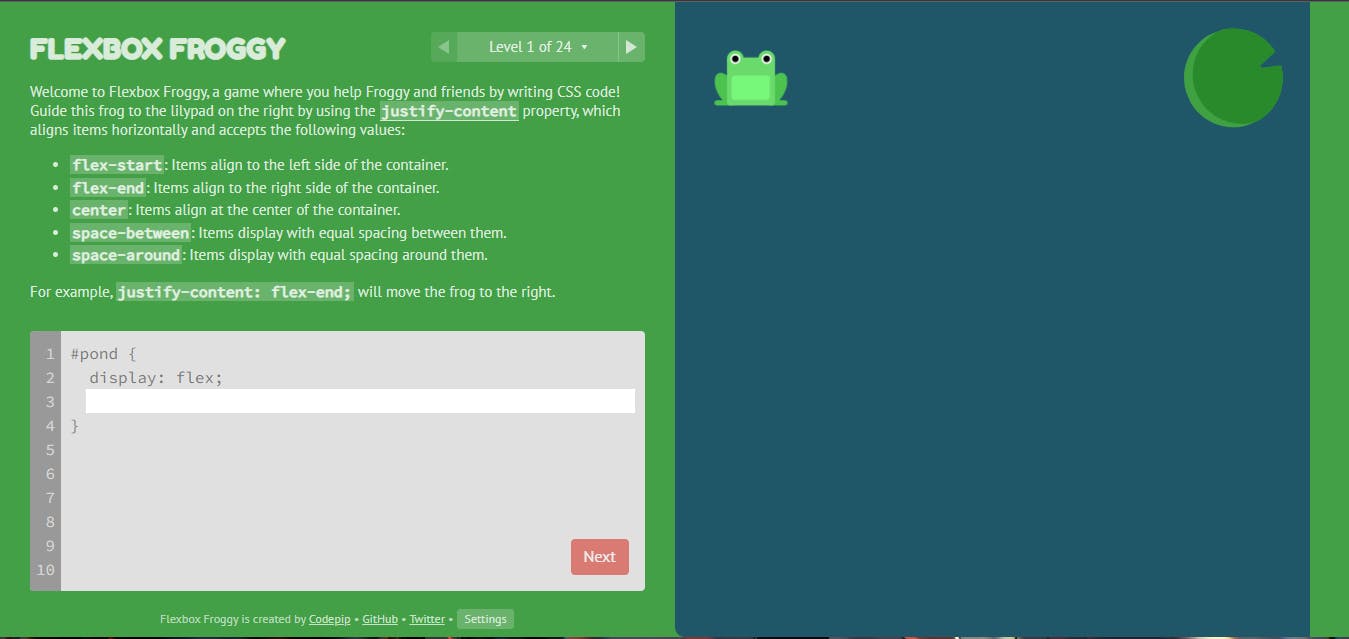
PermalinkFor Practice
You can check out this flexbox game 👉 flexboxfroggy.com
 Thank you for reading 👨💻. If you found this article useful. Share your feedback that would help me in the future.

